


 WRITTEN BY
Paul Wolski
SVP/Creative Director
In the world of retail environment design, sometimes graphics can assume the role of “supporting player,” a visual/aesthetic overlay within the space. It’s not uncommon to view drawings of articulated retail interiors wherein areas large and small are noted with “graphics to come.”
But that’s not to suggest they are a secondary consideration or afterthought. I have been in too many meetings in which graphics were referred to as “pretty pictures” — a dismissive and undeserved simplification.
Actually, graphics do a lot of the heavy lifting to add depth and character to retail spaces, as well as punctuate key zones to help direct, engage, inform and inspire customers. When it comes to retail communication, graphics are essential.
In countless configurations — from overhead signage and storewide campaigns to shelf-level talkers — the success of their combined design and function can depend on minding some key guidelines.
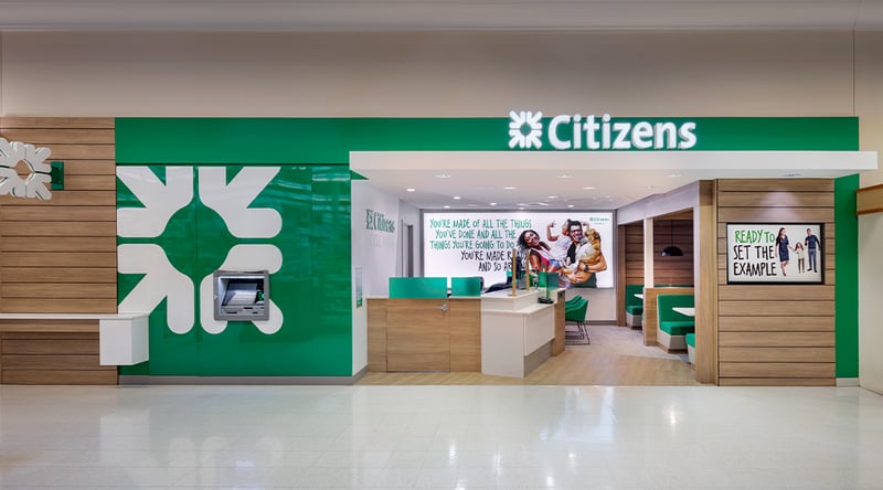
Citizens, located in Hyde Park, Massachusetts.
Blend, but kinda don’t
Often, graphics have a dual role in retail. Typically, they carry the weight of directly and effectively communicating with the customer, which means their presence should be distinct, prominent and bold. Yet they also should seamlessly integrate within the greater environment and complement the overall design.
At the onset of designing an environment, consideration should be given to how the graphic package will play holistically with interior palette selections. Without this alignment, core elements like color, typeface and pattern can clash, resulting in an off-brand look.
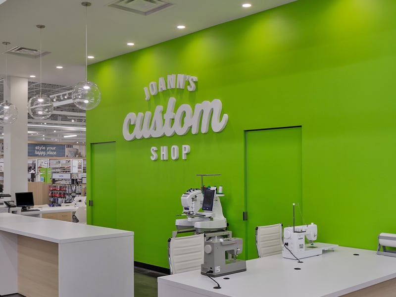
JOANN Fabrics, located in Columbus, Ohio.
Embrace the negative (space, that is)
From big box to boutique, visual stimuli in retail are abundant. As customers, we’ve all gotten pretty good at screening out “noise,” which means retail graphics must work even harder to make an impression.
Using negative space can create a moment of visual calm amidst a busy landscape. Graphics that “breathe” and convey openness and clarity often break through the noise.
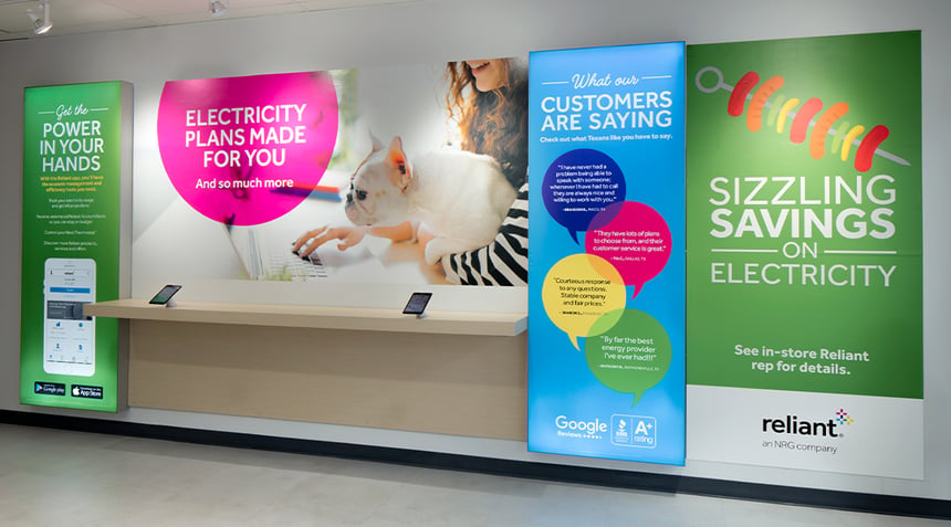 Reliant Specialty Shop within Walmart in Addison, Texas.
Control the flow
If a customer can intuitively and effortlessly read and absorb the message, that’s an effective graphic design.
Being mindful of how to “guide the eye” through a graphic requires an eye for staging the elements to flow naturally from one visual beat to the next. If the composition is too busy or dense, the viewer may not know what you want them to focus on first, then second and so on.
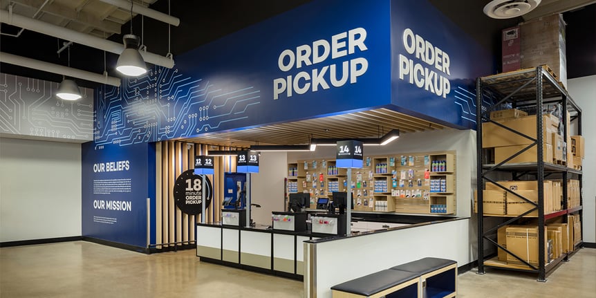
Micro Center, located in Tustin, California.
Don’t miss the point (size)
Typography and scale are critical. Go too small and your message may be whispering when it needs to shout.
It’s best to print out actual-size samples of graphics in advance to make sure readability and impact from a distance are at their best — rather than discover that they lack punch in the space.
Do I really want to read this?
For designers — it’s important to take a step back from the work and view the graphic objectively through the lens of a customer/end user.
After making sure all the required imagery, text and brand standards are accounted for, ask yourself, “Does this make the right impact? Does it catch my eye? Is the message clear?” If any aspect of the design gives you pause, the customer could likely feel the same way.
These practices are by no means revolutionary, but they continue to serve as effective checkpoints when creating retail graphics that need to reach customers, communicate with ease and support a positive retail experience.