.png?width=170&height=44&name=MillerZell_Outline_Black_NO-Tagline_CLEAN-01%20(1).png "Miller Zell")















Prefer listening? Press play above to listen on the go.
This audio is auto-generated. Please let us know if you have feedback.
 WRITTEN BY
Paul Wolski
SVP, Creative Director
Beige.
Despite its apparent neutrality, beige is a color that can elicit pretty extreme reactions.
It can be regarded as an essential element that represents timeless cool and chic sophistication. Yet it can also earn the lowly badge of uninspiring banality. So, what role does beige play in the world of retail design?
In this blog, we'll discuss:
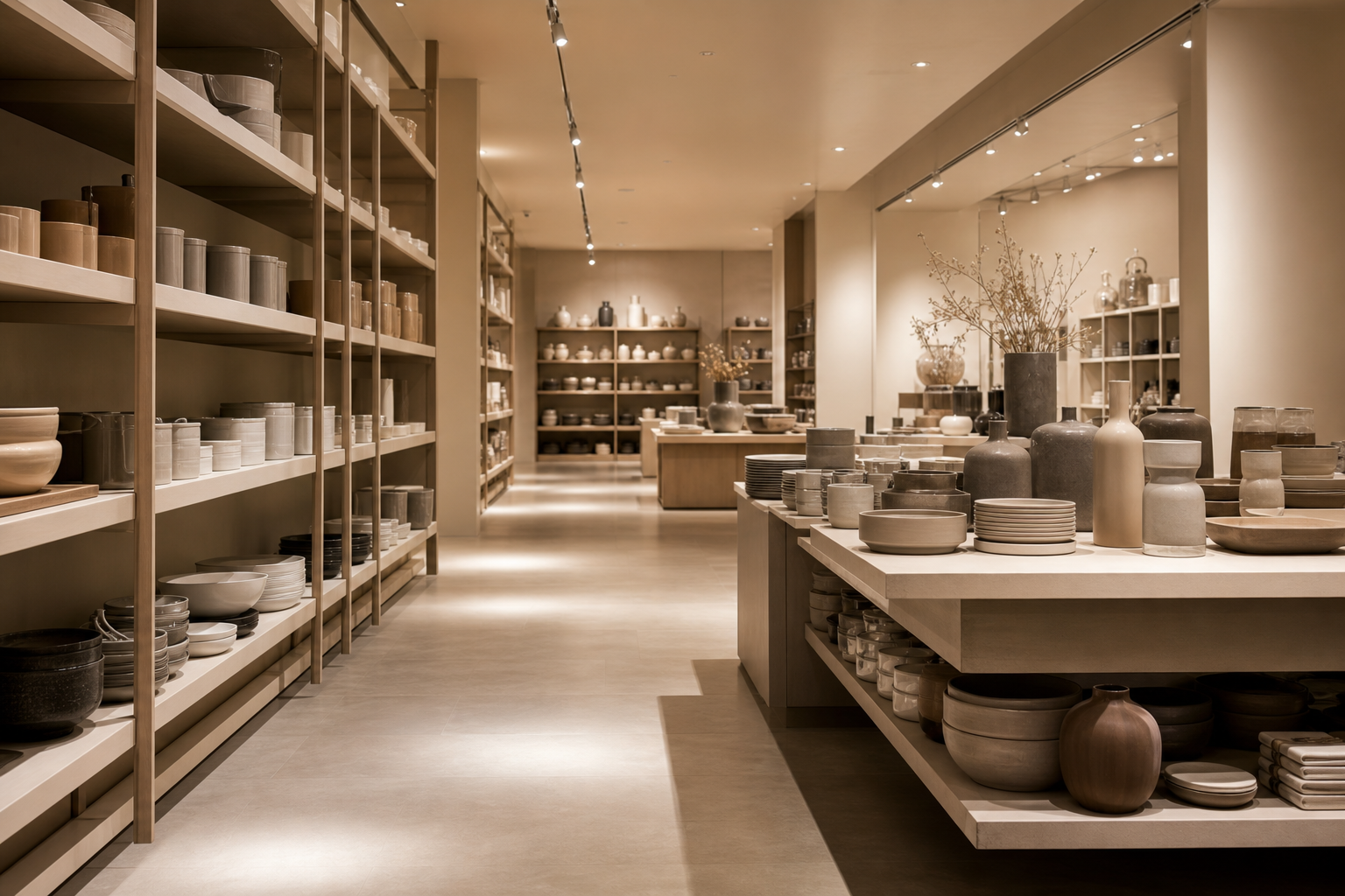
This is an exercise in mindfulness.
Let me state up front: Beige is our friend. It has a place in retail, but it needs to be wielded carefully.
Think of a time when you walked into a store and felt that immediate sense of a brand spark, fueling a presence or connection. And the times when you didn’t. Could it be that a “Beige Effect” muted your engagement?
I’m not referring to just the color. It’s Beige as a state of stasis. A state of mind. When beige becomes the symbol of surrender and suspended design.
What the world wants now is WOW!
And savvy retailers are receiving the message loud and clear.
This is an exciting time for retailers who know their customers, as brands are reinvesting in brick-and-mortar to redefine the Store Experience. That’s experience with a capital “E” because consumers have heightened expectations for the places where they shop, bank, gather and play. They expect to FEEL something beyond a mere transaction.
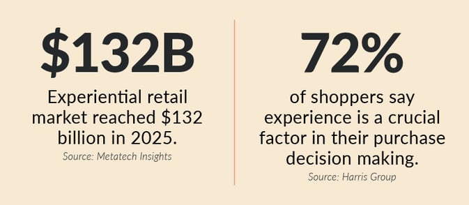
Experiential retail market reached $132 billion in 2025. Source: Metatech Insights; 72% of shoppers say experience is a crucial factor in their purchase decision making. Source: Harris Group.
Propelled by a growing User Experience Economy that thrives on sensory cues, brand storytelling and immersive interaction — and driven by the next generation of consumers who seek meaningful connections with the brands they choose to support — retailers are hyper focused on transforming in-store environments into places that assert a stronger design point of view and deliver brand-rich expression that not only can be seen but also felt.
Beware of the “Beige Effect”
While retail is undergoing this spirited phase of store reinvention to drive consumption and connection — and, in doing so, inspire brand loyalty — there is another trend running alongside this movement that feels both oppositional and passive: the trend of neutrality. As in: Retail spaces with nondescript color palettes. Or retail interiors that feel noncommittal in how they project and express the brand.
These places can be aesthetically clean, well-appointed and pleasantly forgettable. New concept stores often lean into beige to represent tranquil modernity and chic minimalism. But there is a sameness at play among these expressions that feels notably uninventive, even templated.
Not so great if the retail design goal is distinction that engages and delights customers.
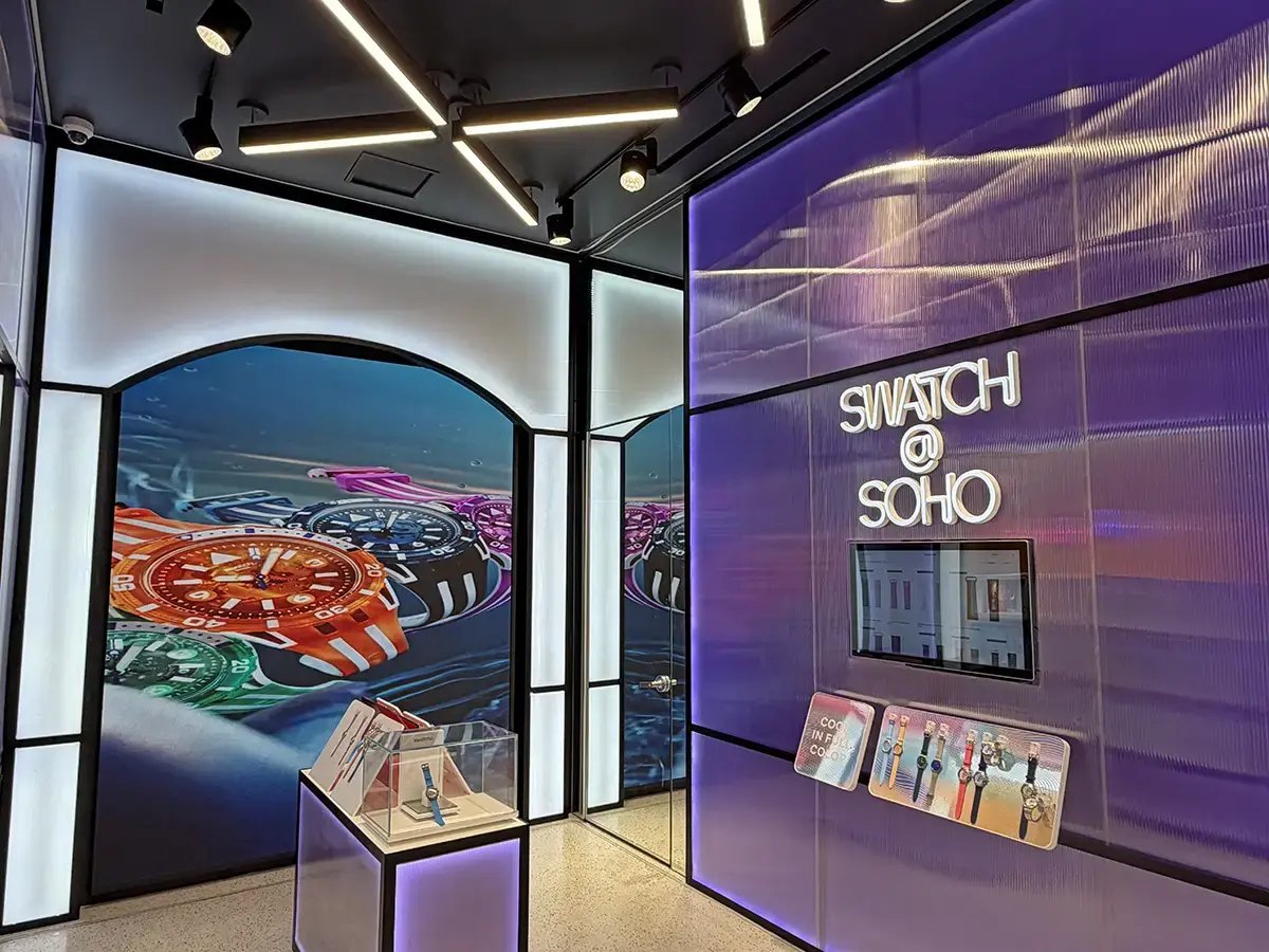
Swatch located in New York, New York.
It’s about finding balance
Now, there are practical and even strategic reasons to employ beige environmentally, but only when it doesn’t prevent brand personality from breaking through.
There are schools of thought that embrace a less design-forward approach, allowing the product or service to be the primary focus while everything else assumes a secondary position. But what if that point of view compromises and/or blurs brand identity?
Keeping up with the rapid rate of change and refresh in retail (at scale) can be overwhelming. So, it’s understandable that there can be a tendency to stay conservative, a reflexive inclination to not swing too far toward a direction or point of view for fear that the fickle winds of change will demand a new course of action.
“The challenge lies in balancing design innovation and practical performance without resorting to cautionary moves that dilute the store, the brand and customer experience.”
This is where the Beige Effect starts creeping in. It’s accepting the safer play, implying that going neutral offers strategic flexibility and operational ease. But ultimately it can come off as ambiguous, basic or downright boring.
The challenge lies in balancing design innovation and practical performance without resorting to cautionary moves that dilute the store, the brand and customer experience.
In retail, it’s important to stay nimble, but it’s also essential to remain memorable.
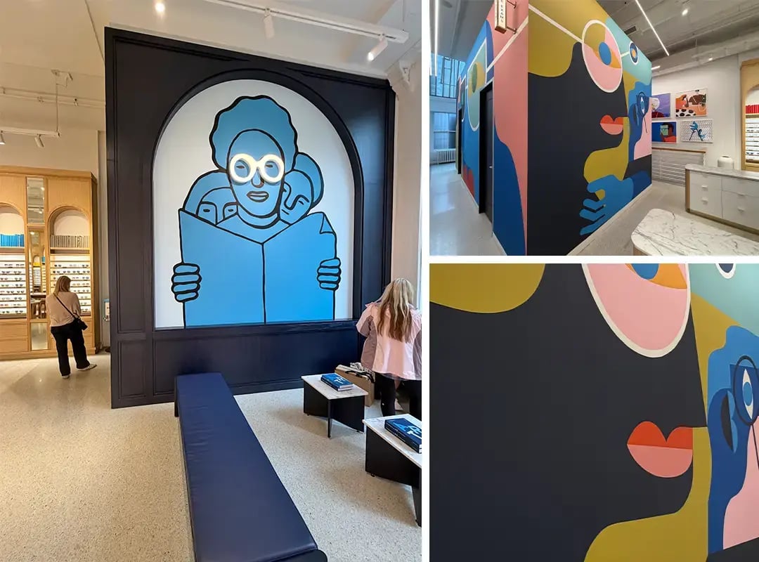
Warby Parker located in New York, New York. A perfect example of how environmental graphics can transform retail into an immersive brand experience.
How to avoid “Beige-ing Out”
Thought starters, watchouts and gut checks
1. Cast beige in the right role
If your retail space is the stage, beige serves as a great supporting player to let the brand take the spotlight. Creating a neutral base layer that grounds the physical environment enables an in-store kit of parts to deliver robust brand expression through color, graphics, interior signage, digital content, décor and art. That’s the beauty of a well-designed and fully considered kit of parts. It can contain all the elements of brand personality needed to activate a retail space while remaining nimble enough to change components over time and refresh those spaces seamlessly, consistently and affordably. A smartly composed neutral/beige base can provide environmental stability without triggering more invasive interior or structural renovations.
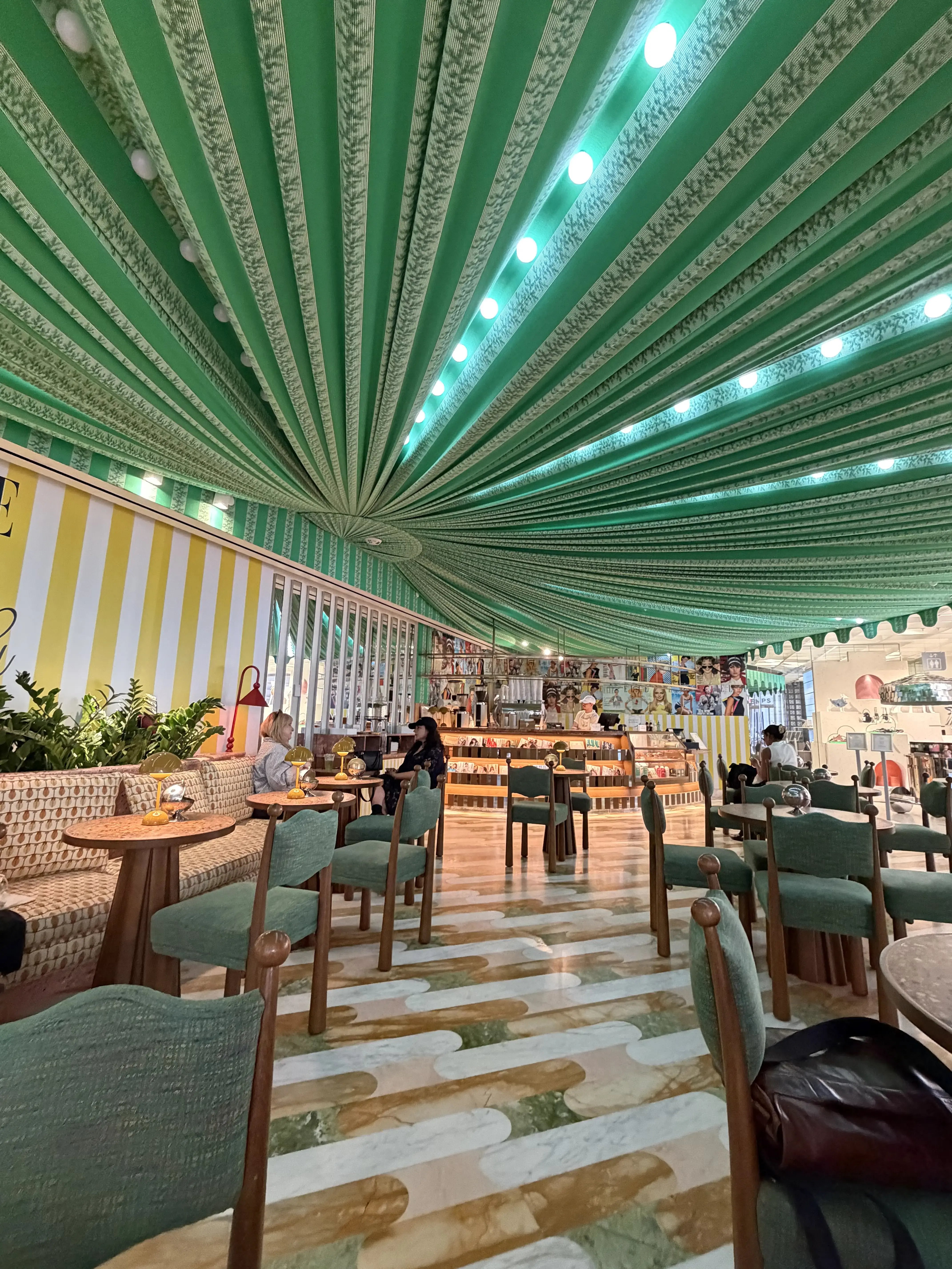
Printemps New York located in New York, New York. The café transforms hospitality into a branded experience. Rich color, layered textures and luxurious fabrics create an atmosphere that feels distinctly elevated.
2. Give beige a little boost
It’s important to clarify that using beige (or other low-key or neutral colors) doesn’t necessarily equate to blah or boring. Embracing a neutral foundation can still include thoughtful choices on materials, patterns, finishes, fixtures and lighting to elevate environments with subtle detail, visual richness and depth of character.
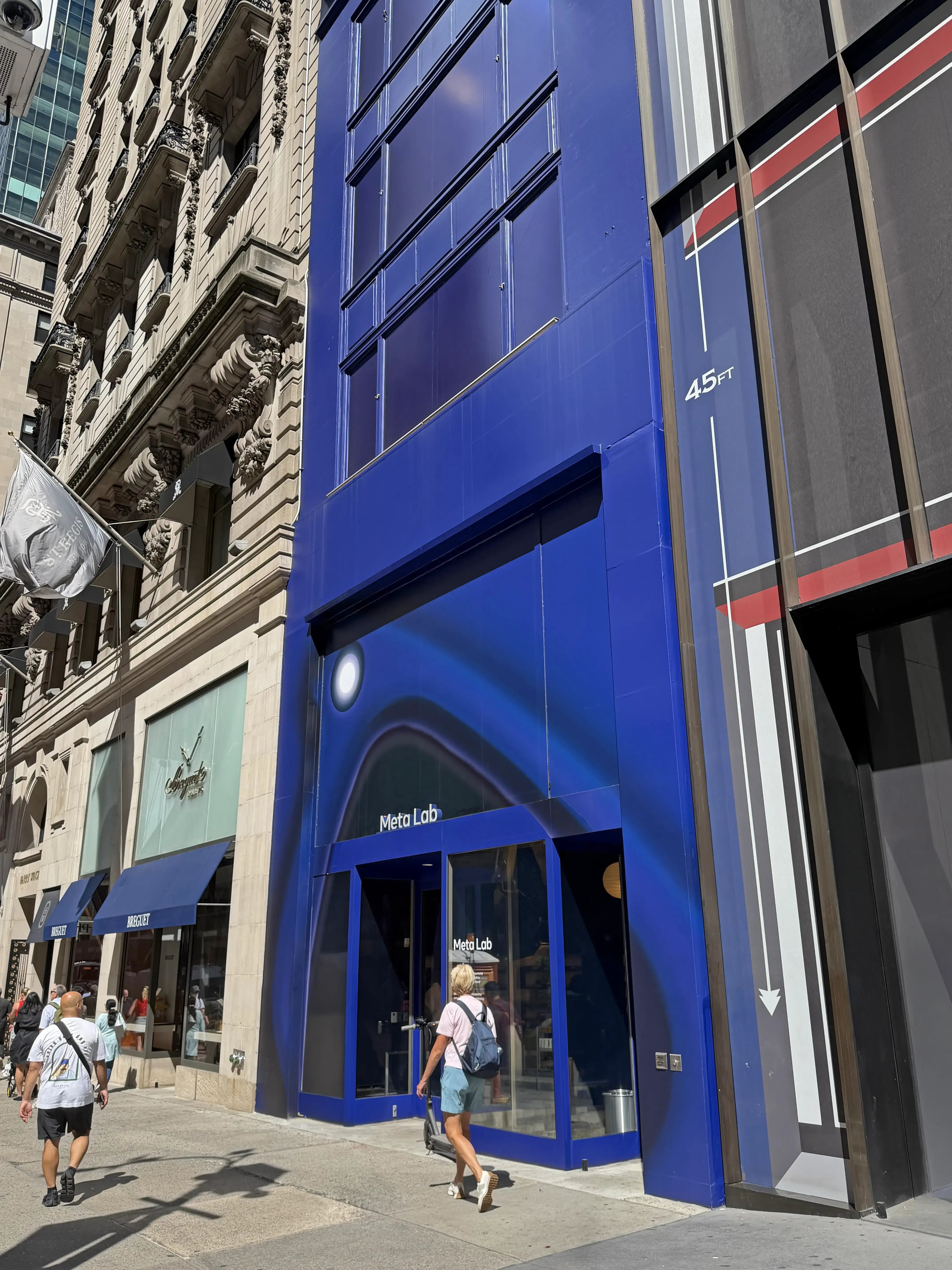 Meta Lab located in New York, New York.
3. Don’t be phobic about color
This may sound design basic, but reluctance to embrace color, especially one’s brand color, in the store environment is a challenge we continually encounter. It’s understandable; most brand colors on their own are bright and bold and can seem aggressive or overwhelming if improperly applied spatially. If using the color feels unwieldy, retailers sometimes react too drastically by removing the color almost entirely from the space, opening the door to safer neutrals or allowing beiges to take control. And therein lies the risk. Color is a powerful, emotive tool that can infuse a space with energy and attitude. If palettes start to go too soft or benign, the brand may be reduced to a whisper when what it really needs to do is shout. Getting strategic and clever about how color shows up — in ways great and small — is the key. Beyond bolder statements like illuminated logos or floor-to-ceiling brand walls, color can be expressed in fresh ways through wall coverings, accent lighting, digital content, branded art/décor and even color returns on fixtures or dimensional letters.
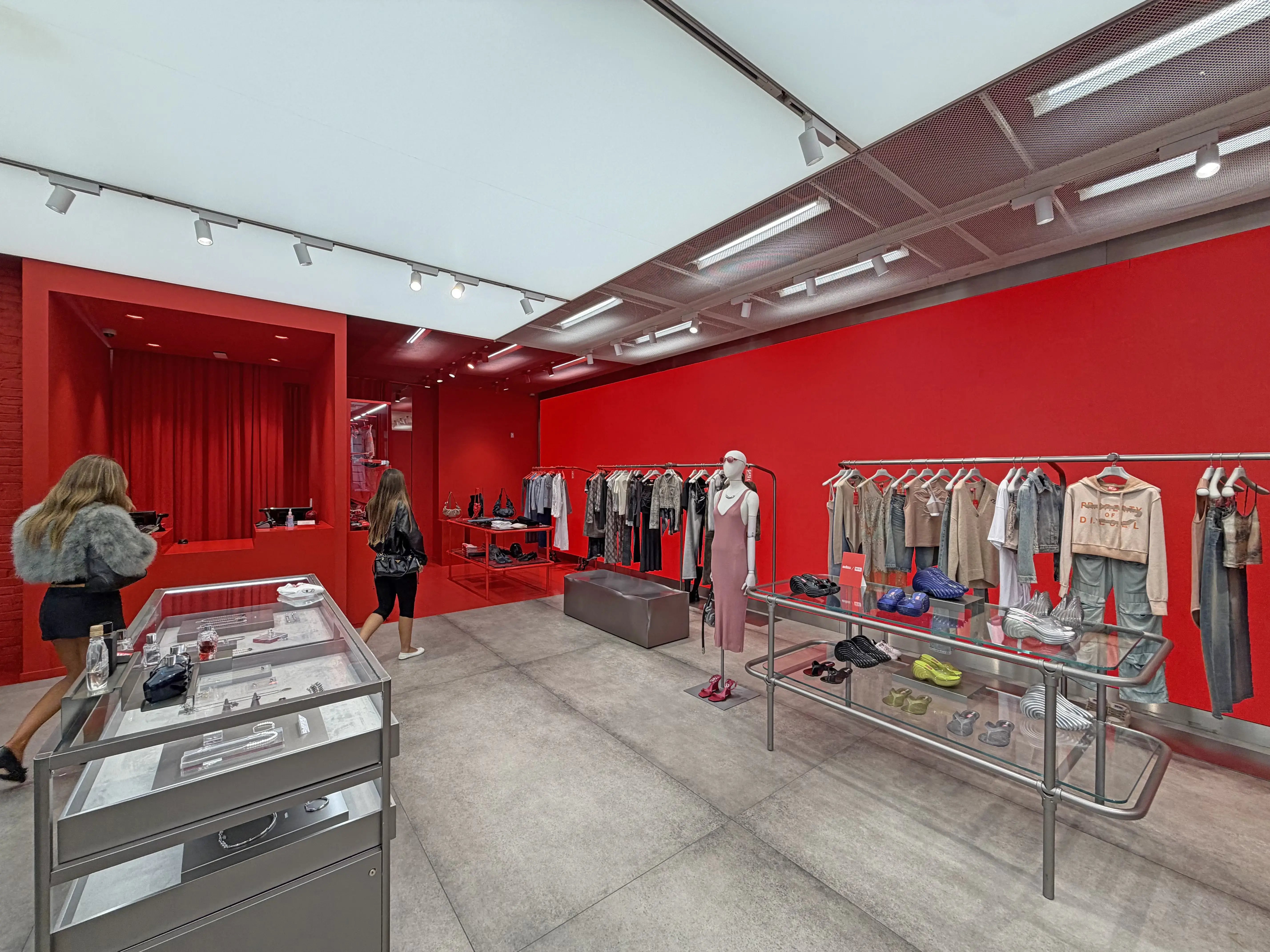
Diesel located in New York, New York. Here, a single, unapologetic hue defines the entire environment, creating instant recognition while allowing the product to command attention.
4. Rediscover and reconnect your brand in-store
Being on the lookout for beige infiltration doesn’t mean that embracing a bold or brash maximalist store design is the appropriate response or antidote, unless that is what best reflects or suits the brand. Instead, this is about practicing mindfulness when viewing the store as a meaningful connection point for shoppers to engage and ideally bond with the totality of the brand, which includes product offerings, service models and associate interactions, all housed within a physical environment that ties everything together.
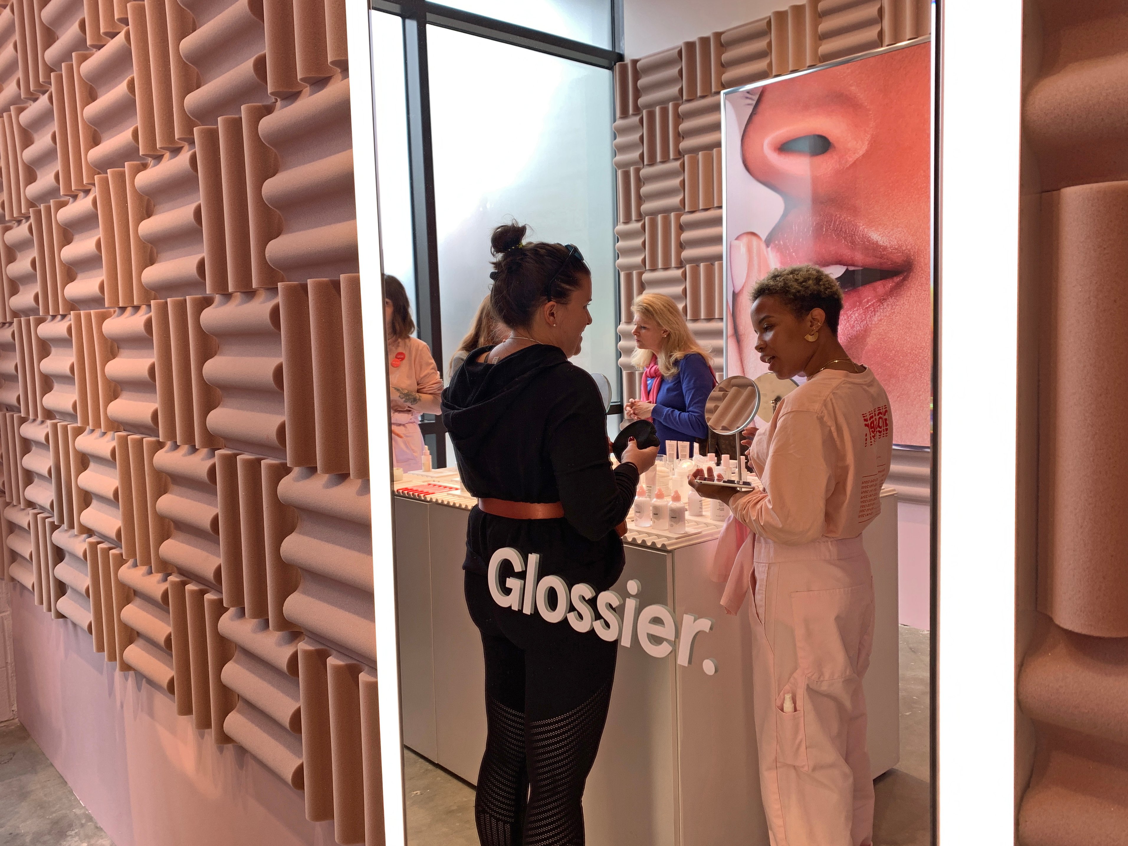
Glossier located in Atlanta, Georgia. Soft blush pinks paired with warm beige hues create a palette that feels elevated.
In conclusion...
It’s helpful to re-evaluate how a current store design — which can exist in varying degrees of expression across a large network — reflects core brand attributes through interior elements that help tell the right brand story.
If the store feels as though it has drifted into a middling state, it could signal an opportunity to look at ways to revitalize a stagnant kit of parts and fortify brand presence.
Brick-and-mortar retail has never been more challenging — or more exciting — to reclaim. Beige-ing out could seem like a quiet retreat, one to generally avoid.
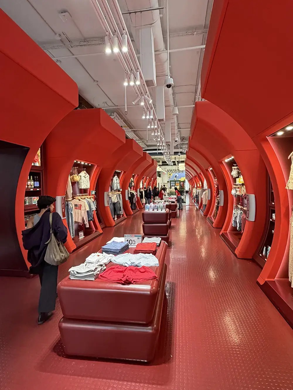
Target concept retail store located in New York, New York. Target brings the brand to life through an immersive experience that's equal parts inspiring and shoppable.